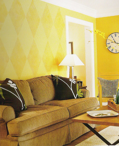
 When I bought the house, all the walls were plain white. I wanted to paint the hall a warm, golden color (as in the inspiration photo to the left), but my first attempt came out as pumpkin puke:
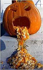
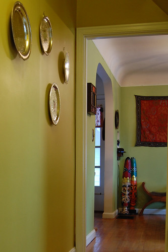
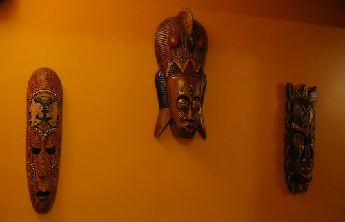
The wall décor was also a disaster. I loved the idea of a “mask gallery,” but the passage simply isn’t wide enough to accommodate the bulky masks and a grown adult. The masks were constantly knocked askew.
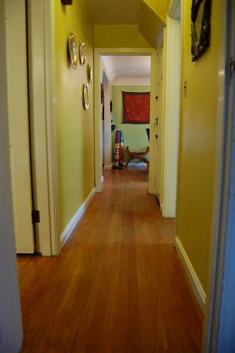
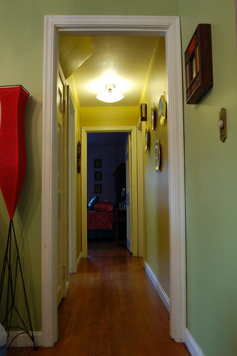
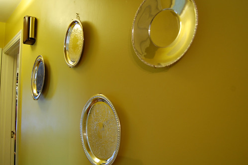
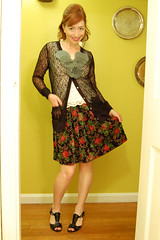
I tried tried again with Golden Cricket paint and polished silver platters and I’m quite pleased with the new décor.
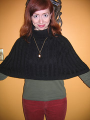
The mustard yellow wall is a great contrast to my outfits, but all that reflected yellow light is a challenge. While it gives my skin a golden glow, it also skews the colors of my clothing. The yellow aura bothered one reader so much that she wrote to tell me so. I stubbornly continued to pose here, but soon learned to set the white balance to incandescent +3 to correct for all that yellow. (Photoshop “auto levels” also helps….if there is some true white and true black in the image.)
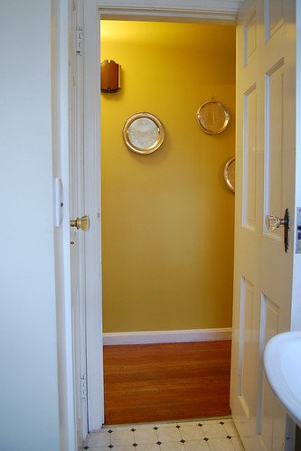
When I take my photo against the yellow wall, I position my camera and tripod in the bathroom. Glamorous, right?
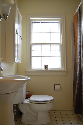
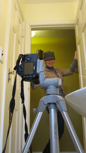
To light the photos, I turn on all the fixtures in the bathroom, the hallway light, the dining room light, and the light in the India Room. Still, I have to pump up the exposure compensation because the camera takes its light read from the white woodwork in the bathroom, not the darker subject in the doorway. I set the exposure compensation between +.3 and +1.0 and use an ISO of 800. (The camera is in "P" or Program mode.)
The Mustard Hallway, through the blog years...
Here’s the pumpkin puke:


I used the flash back in the pumpkin days.
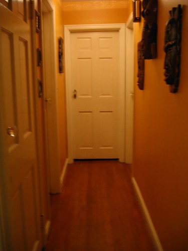
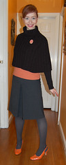
After painting the hallway Golden Cricket, and discontinuing use of the flash, I often looked a little jaundiced:


Taking a digital photography class through Communiversity changed my life…and my photos:

Hello, white balance!
Finally, I stopped cropping my photos to odd sizes and adopted a standard 2 x 3 ratio. As a result, you now see the bathroom woodwork at the edges of my photos, but I don’t care:
Next month: The Sunroom!
9 comments:
Very cool look at your photographic environment. Thanks for all the details!
I love the bright yellow much better and the silver on the walls very funky. Can't wait to see next months.
Your outfits are always so creative and colorful...i would be surprised if your home wasn't the same way. The yellow seems to fit you better than pumpkin puke!
Love this little history! I'm still struggling with anything but auto settings; my pics seem to come out worse if I set them..oopsey. Maybe I need to take that photography class....Paula
How much fun are those diamonds in the inspiration pic!?!? You should totally do that too!
This is my favorite regular feature. That is all.
<3 <3 <3
I'm doing my bedroom a yellow this summer, and that is the tone I want to go with.
I found your blog a few weeks ago and am so happy; I LOVE your style and you have inspired me to add more colour to my own wardrobe... I've had so many good comments since I have started to do this and its all thanks to your inspiration. You've made an otherwise dull winter in the UK bright and sunny. Thank you! Kate x
lol...my kitchen and dining room are the puke pumpkin...I love it on these walls,but have to admit that I prefer the lighter color on your hallway...maybe the fact that it is a more enclosed area makes the darker color not work...anyway..love all your fashions and the way you put them together.
Post a Comment